Which neighborhoods in America offer children the best chance to rise out of poverty? The Opportunity Atlas answers this question using anonymous data following 20 million Americans from childhood to their mid-30s.

This resources helps explore community conditions that predict life expectancy, comparison and ranking of scores across the state, and determining actionable policy solutions to improve health.
The DCI is a new and interactive way to visualize economic distress and prosperity across 25,000 zip codes in the U.S.
1
Developed by the Housing Assistance Council (HAC), The Rural Data Portal is an easy to use, on-line resource that provides essential information on the social, economic, and housing characteristics of communities in the United States.
The Rural Data Portal is targeted toward rural communities, but a wide range of information is presented for the nation, states, and counties for rural, suburban and urban areas. Most of the information provided in the RURAL DATA PORTAL come from Housing Assistance Council (HAC) tabulations of various public use data sets such as the 2010 Census of Population and Housing, the American Community Survey (ACS) and Home Mortgage Disclosure Act Data.
The site includes:
2
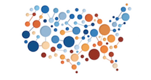
The American Communities Project (ACP) sets out to find a better way of understanding the different types of communities that make up America so we can develop new and better ways of recognizing and measuring what works and what does not.
A combined social science/journalism effort based at the Michigan State University School of Journalism, the ACP uses a vast array of data – from election results and economic numbers to consumer survey and polling – to break communities into different types for analysis. Working with academics, the ACP used a wide range of different factors and a clustering technique to identify 15 types of counties, everything from Big Cities to Aging Farmlands. It has mapped those types to show where the country’s political, socio-economic and cultural fissures are.
The Project correlates economic and demographic data to election results and consumer data to see what is moving those different communities and to see who is struggling and who is thriving in the 21st Century United States.
The ACP’s 15 community types:
African American South, Aging Farmlands, Big Cities, College Towns, Evangelical Hubs,
Exurbs, Graying America, Hispanic Centers, LDS Enclaves, Middle Suburbs,
Military Posts, Native American Lands, Rural Middle America, Urban Suburbs, Working Class Country
The website also includes:
3
A collaboration of the Robert Wood Johnson Foundation, the Centers for Disease Control and Prevention, and the CDC Foundation, PLACES enables users to easily browse data about health for every neighborhood and zip code in the United States.
PLACES includes 27 different health measures related to behaviors, health outcomes, and prevention practices, ranging from mental and physical health, to access to health insurance and preventive screenings. Regardless of population size and urban-rural status, local health departments can use PLACES to better understand the burden and geographic distribution of health-related outcomes and assist in planning public health interventions.
The site also includes:
4
Which neighborhoods in America offer children the best chance to rise out of poverty? The Opportunity Atlas answers this question using anonymous data following 20 million Americans from childhood to their mid-30s.
Now you can trace the roots of today’s affluence and poverty back to the neighborhoods where people grew up. See where and for whom opportunity has been missing, and develop local solutions to help more children rise out of poverty.
The Opportunity Atlas allows users to interactively explore data on children’s outcomes into adulthood for every Census tract in the United States. This can inform local efforts to build equitable, prosperous, and healthier communities.
The platform also allows viewers to overlay their own data onto the map. Whether it is the location of liquor stores or parks, rates of asthma or pre-term births, proximity to transportation or hospitals—that feature reveals how any of those health-impacting factors, or a combination of them, correlate with upward mobility.
In each of these communities, very big data is being used to look at very small areas. We think that is the way forward in the drive to create healthier, more equitable, and more prosperous neighborhoods across America.
5
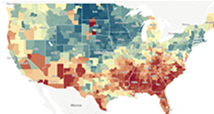
The Distressed Communities Index (DCI) is an interactive way to visualize economic distress and prosperity across 25,000 zip codes in the U.S.
The DCI combines seven complementary metrics into a broad-based assessment of community economic well-being in the United States. Relying on Census Bureau data for the years 2011 to 2015, the DCI covers over 26,000 zip codes and 99.9 percent of the U.S. population as well as cities, counties and congressional districts, enabling Americans to understand how their local well-being stacks up at every scale of life. The DCI groups places evenly into five different tiers based on their performance on the index: Prosperous, comfortable, mid-tier, at risk, and distressed.
Use the DCI’s interactive maps to find data by zip code, county, congressional district, or city.
The site also includes a thorough Methodology section and links to a detailed report on the DCI.
Learn more about the organization that developed the DCI, the Economic Innovation Group and their other projects here.
6
The California Healthy Places Index (HPI) is a dynamic interactive resource, designed to support informed prioritization of public and private investments in communities statewide.
Developed by the Public Health Alliance of Southern California, with support from Virginia Commonwealth University’s Center on Society and Health, HPI helps explore community conditions that predict life expectancy, comparison and ranking of scores across the state, and determining actionable policy solutions to improve health.
There are several features on the HPI to facilitate ease-of-use and accurate interpretation of findings. Using percentile ranks, the data is relatively easy to interpret for 25 indicators and many more health outcomes, risk behaviors and other factors. For its many selectable geographies – from census tract level, to city or county, or legislative districts or more – an overall HPI score reflects a weighted and validated combination of 25 community characteristics. These scores for each census tract can be compared across the state.
The community conditions, or HPI Indicators, fall into eight important policy action areas, including: Economic; Education; Housing; Health Care Access; Neighborhood; Clean Environment; Transportation; and Social Factors. For each HPI Indicator, a detailed policy guide is available with specific, relevant and concrete policy interventions aimed at improving that community condition and community health.
7
HealthLandscape is an interactive web-based mapping tool that allows health professionals, policy makers, academic researchers, and planners to combine, analyze and display information in ways that promote better understanding of health and the forces that affect it.
HealthLandscape is a division of the American Academy of Family Physicians, working with the Robert Graham Center in the successful development of the HealthLandscape mapping platform (the platform is free but a login is required). The tool brings together various sources of health, socio-economic and environmental information in a convenient, central location to help answer questions about and improve health and healthcare. HealthLandscape can be used to create maps from publicly available data sets including regional criminal justice, education, healthcare, and demographic data, allowing users to discover community characteristics and share information with health professionals, policy makers, and legislators.
Before developing a map, check out the “Why Choose Us” section of the site to see the myriad of ways HealthLanscape maps and data visualization tools can be used.
Within the Featured Projects section you will find a list of demonstration sites and more examples of mapping tools compiled by HealthLandscape.
Using Geospatial Analysis, HealthLandscape is dedicated not only to data democratization and data visualization, but also to research related to health, health care and social determinants of health. HealthLandscape is actively:
8
Opportunity360 is a comprehensive approach to understanding and addressing community challenges developed by Enterprise Community Partners. It helps identify pathways to greater opportunities using cross-sector data, community engagement and measurement tools— all available through a user-friendly web interface.
Partners in community development will gain a deeper understanding of available resources through Opportunity360, leading to smarter investments, thoughtful solutions, and stronger communities.
The tools and resources available on the site allow you to assess opportunity in a comprehensive way.
Measure: The OPPORTUNITY360 Measurement Report offers a wide range of data about the opportunity pathways and outcomes of a neighborhood to quickly discern the assets and challenges. The primary opportunity outcomes are: housing stability, education, economic security, health and well-being, and mobility.
Listen: Use community engagement tools to complement and enrich the data provided in the measurement report with lived experience.
Partner: Identify providers of low-cost and no-cost services throughout the U.S.
Evaluate: Evaluate the impact of your work.
With more than 200 indicators, as well as resident feedback aggregated into one platform, Opportunity360 provides a comprehensive illustration of the factors that drive positive opportunity outcomes that will change the way we address issues in the field such as poverty, inequality and community investments.
Have questions on where to start with Opportunity360? Visit the FAQ.
9
The Vita Health and Wellness district VitaImpact website is an interactive tool, designed to show linkages between targeted social initiatives and the many other aspects by which they can broadly impact a community.
Although the site was designed to reflect the variety of efforts at work in the Vita district of Stamford, Connecticut, it is configured for application to any community and is intended to be a ‘living’ site where content and linkages are continuously updated so that successive visits are never the same! Please see our helpful introductory video presentation.
Our “village” is tagged with seven of Vita’s key program initiatives: Community Building; Revitalized Public Housing; City Improvements; Communal Farm; Health Care Access; Small Business & Jobs; and Parents as Co-Educators. Clicking on any of the tags will bring you a description of the program activity, along with a few facts about its purpose, partners and any outcomes measured. Under the program title you’ll see an array of icons to depict the Impact Areas that are activated by the program: some with as few as three and others with as many as nine impact areas!
To create the catalogue of potential impact areas for the Vita initiative, we utilized the Health Impact Assessment model of the National Research Council (2011), and selected the following ten areas:
Click on any of those icons (at the bottom left) and you’ll find a detailed, “Vita-centric” description along with a “more” arrow which is a short cut to the program initiative that it is linked to. Additional links embedded in each definition and drop-down screen will bring you to our many descriptive resource materials, including studies, videos, images and reports that support each one.
For more information on the Vita Impact website, please contact Vincent Tufo at vtufo@charteroakcommunities.org.
10
Dignity Health developed the first standardized Community Need Index (CNI) in partnership with Truven Health Analytics. The CNI identifies the severity of health disparity for every zip code in the United States based on five specific barriers to healthcare access.
Rather than relying solely on public health data, the CNI accounts for the underlying social and economic barriers that affect overall health. Using a combination of research, literature, and experiential evidence, Dignity Health identified five prominent socio-economic barriers that enable us to quantify health care access in communities across the nation: Income, Cultural/Language, Education, Insurance, and Housing. The tool allows you to generate a map based on city or county. By identifying barriers, Dignity’s CNI tool attempts to demonstrate links, at the city or county level, between community need, access to care, and preventable hospitalizations.
For more information on how the five barriers were selected, what the scores mean, and how to use the CNI, click here.
11
The National Equity Atlas, developed by PolicyLink and the University of Southern California’s Equity Research Institute (ERI), is a comprehensive online resource for data on demographic change, racial and economic inclusion, and the potential economic benefits of racial equity.
This first-of-its-kind data tool is for the community leaders and policymakers who are working to build a new economy that is equitable, resilient, and prosperous—region by region, and state by state.
The Atlas is a tool for social change. Beyond providing data, charts, and maps, the Atlas shares policy ideas, examples of how communities are using equity data to drive policy change, and more. It equips community leaders with facts and analyses to:
The Atlas is a living resource, and PolicyLink and PERE recently added more disaggregated racial/ethnic data by ancestry for six equity indicators including wages, education, and youth disconnectedness for the largest 100 cities, largest 150 regions, all 50 states, and the United States as a whole.
You will find a short summary highlighting changing demographics and key equity indicators for your community here: http://nationalequityatlas.org/data-summaries
Explore the 32 Atlas indicators in-depth here: http://nationalequityatlas.org/indicators
In the “About the Atlas” section you can find information about methodology and indicators, data sources, and FAQs: https://nationalequityatlas.org/about-the-atlas
Check out our “Data in Action” section for stories about the data in the Atlas, recent updates, and examples of how communities are using equity data to drive change efforts: http://nationalequityatlas.org/data-in-action/stories
The National Equity Atlas recently added the Racial Equity Index. This tool can help communities identify priority areas for advancing racial equity, track progress over time, and set specific goals for closing racial gaps.
12
Want to show how where you live contributes to how long you’ll live? This site tracks differing life expectancy along transit stops and highway exits in Atlanta, Chicago, Las Vegas, New York City and Richmond, VA.
A series of ready-to-use maps, developed for the RWJF Commission to Build a Healthier America, show life expectancy disparities by freeway exit or transit stop in Atlanta, Chicago, Las Vegas, New York City, and Richmond, VA. Twelve additional cities are coming soon. The database combines vital statistics and population data to calculate newborn life expectancy, and underscores the connection between neighborhood conditions and health.
The project is a collaboration between the Robert Wood Johnson Foundation and the Virginia Commonwealth University Center for Society and Health.
13
PolicyMap is an interactive tool developed by The Reinvestment Fund (TRF) for research, market studies, business planning, site selection, grant applications, and impact analysis. Available data include demographics, home sales, health data, mortgage trends, school performance scores, workforce data, and crime statistics.
Using GIS data, this tool allows users to create thousands of maps on neighborhood demographics. Use the maps for public policy, state funding, or business expansion initiatives, for example.
Although some of the services are fee-based, PolicyMap also provides free interactive mapping tools, such as an embed map, or widgets and Data API that help create maps, tables, and reports.
15
The Child Opportunity Index is an interactive tool that lets you visualize how neighborhoods in the 100 largest U.S. cities fare on creating opportunities for children to be healthy physically, socially, and developmentally.
The Child Opportunity Index captures the many neighborhood conditions and resources that influence child health and development. The index and its corresponding interactive mapping tool help planners understand whether all children have equitable access to neighborhood opportunities. The Index is a product of diversitydatakids.org and the Kirwan Institute.
Because the index can simultaneously assess up to 19 measures of neighborhood contributors to health, it can better capture the combination of risks and resources that make up a child’s neighborhood. No specialized training is needed to use the tool. The mapping tool covers all neighborhoods (census tracts) in the 100 largest U.S. metropolitan areas.
Use the tool to:
• Guide conversations about the extent of inequities in children’s neighborhoods
• Inform community investment planning efforts and community needs assessments (including data reporting under the Affordable Care Act)
• Facilitate community-focused equity studies (e.g., fair housing assessments, health impact analyses)
• Watch a video tutorial to learn how to access a Child Opportunity Map, interact with the various map features, overlay the child population by race and ethnicity, and interpret your map.